
While it's easy to think of the Internet as a concrete thing to which we connect, the real magic comes from the connections between the tens of thousands of network providers that comprise the Internet.
Internet exchange points are where a lot of major networks connect to each other. When I'm watching Netflix over my Comcast connection, an IXP is probably where the bits from Netflix flow onto Comcast's network towards me. When you download a Windows update, that data flows from Microsoft to your ISP in an IXP.
While the volume of traffic exchanged at IXPs is staggering, most IXPs don't publish individual graphs of each network there. PIT Chile, an IXP in Chile, does. And it's pretty interesting.
For one thing, it shows the diurnal ebb and flow of traffic:
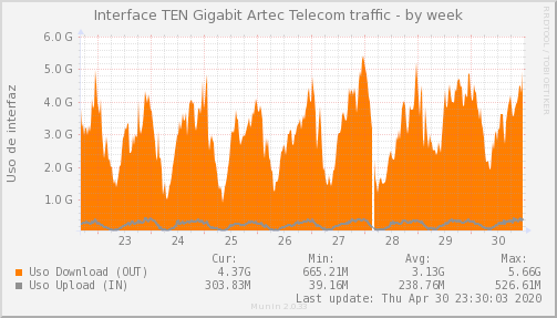
But it also shows another interesting bit: there tends to be a major imbalance in bandwidth inbound versus outbound. This particular ISP's network port saw an average of 3.13 Gbps inbound traffic (i.e., customer downloads), but only about 239 Mbps outbound: more than a 10:1 imbalance. It makes sense: a typical customer might send a simple GET request to load a webpage that contains a bunch of images, or might be watching a streaming video.
Conversely, there are the content networks, typically on the other side of that equation. Facebook is closer to a 20:1 outbound ratio here:
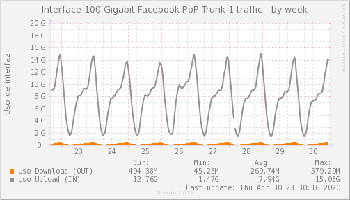
The orange inbound traffic barely registers on the graph. The shape of that traffic is interesting, too. Here's a 24-hour view:
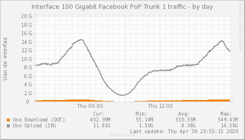
Bandwidth, understandably, drops off in the middle of the night, though it's kind of interesting to me how surprisingly smooth a lot of these charts are. The peaks are interesting, but I'm not seeing them on other networks. Here is Cloudflare, for example:
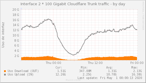
It seems as if these charts are showing something closer to 36 hours? It shows the same relatively smooth dip overnight, with a bit of a peak in the later evening, but not quite as pronounced as with Facebook's graph.
Also of note in the above graph: the graph text suggests that this is a 100 Gbps connection (or possibly a pair of two of them bonded?), but peak usage was just over 16 Gbps. This makes a lot of sense for Cloudflare, whose business model involves being able to soak up DDoS attacks. They have enormous headroom: and this is just in Santiago, Chile.
Compare this with a smaller ISP's 1 Gbps connection to the exchange:
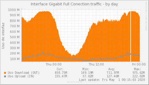
It sure looks like they're maxing out their port. Due to overhead, you're never going to quite get exactly a full 1,000 Mbps, but you can also imagine that that flat peak towards the left probably ought to look a little more rounded based on how it slowly ramps up and then down. Not only does this mean that their customers are probably starting to see slowdowns, but they have no room for growth.
Finally, let's look at what seems like a new member of this exchange: Netnod, operator of one of the thirteen logical root nameservers. Theirs is i.root-servers.net. I always get cantankerous when the media portrays that there are "only 13 root nameservers," because just I-Root has "more than 55 nodes distributed across the world."
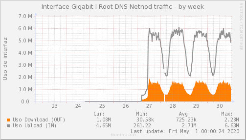
The actual volume of traffic is relatively low; peaking at less than 7 Mbps of traffic. But, like with Cloudflare, this is leaving tremendous headroom (using 7 of the 1000 Mbps on their link), and is just the servers in Chile.
It's also interesting to note that, perhaps due to the nature of DNS, they're at maybe 4:1 outbound:inbound. In normal operations, they receive a small query and send a small response.
In a sense, it's surprising to me that they're seeing nearly as much traffic as they are: that's a whole lot of requests for finding TLDs.
In conclusion, bandwidth graphs are fun when you're a nerd.